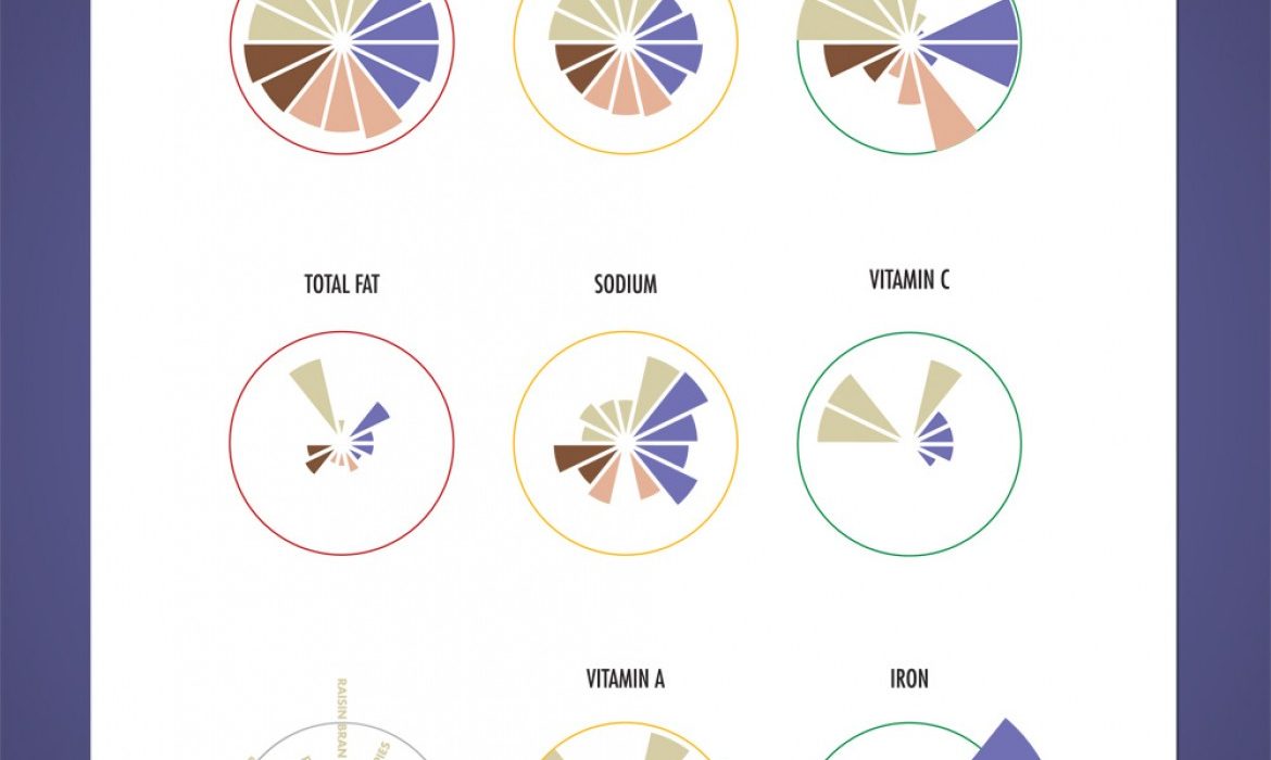
This project was the first foray into information design/infographics. The goal of the project was to visually represent the nutritional values of many popular kinds of cereal. The challenge was that there was a vast disparity in the values. In values like sugar and iron, a single serving was very close to hitting 100% of the daily recommended amount whereas in others like total fat and calories, the amounts in one serving were only around 25% of the daily recommended amount. If the scale for all was the same, some would be unreadable whereas others would dominate the space. The solution that successfully showed the relation between all values while keeping everything readable was brought about by a tiered approach. By splitting the nutritional data into three columns, we were able to dedicate a space for the small, moderate, and large values.


